Using CODED FLOWS
Building UI Flows
A UI Flow in CODED FLOWS allows you to visually design the user interface (canvas) of a Streamlit application while simultaneously defining the logic (flow) that connects events to actions for each visual element.
This guide will walk you through creating a simple UI Flow example: uploading an image, extracting its Red, Green, and Blue color channels, and displaying each channel separately.
Creating a New UI Flow Project
To start building a UI Flow, you first need to create a dedicated project:
Launch CODED FLOWS.
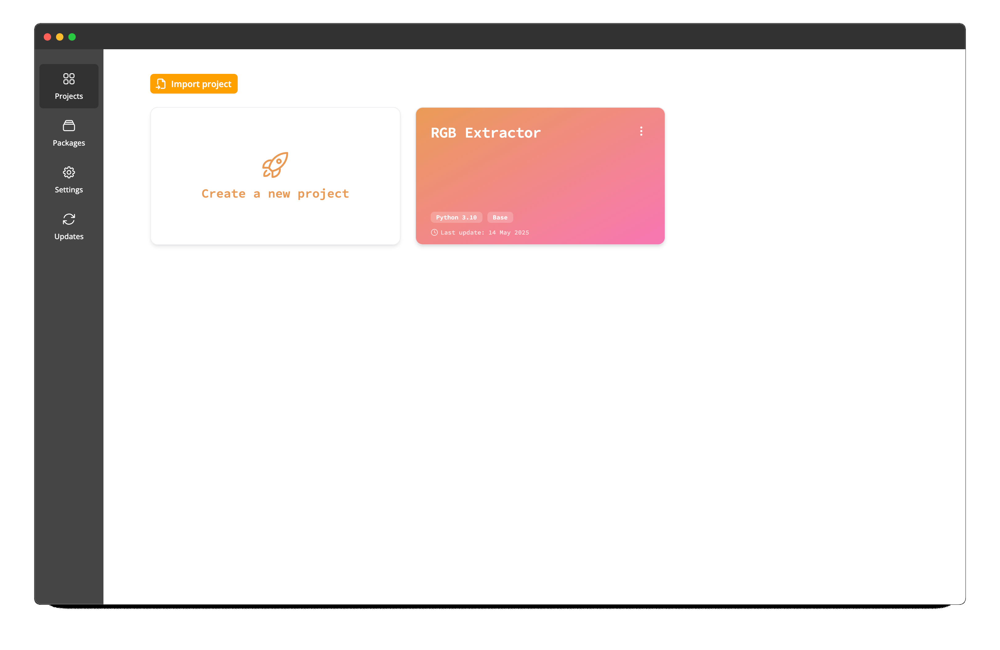
From the main project list screen, click on the button to create a Create a new project.
In the project creation window, configure the following:
- Project Folder: Choose the directory where your project files will be stored.
- Project Name: Give your project a descriptive name (e.g., "Streamlit RGB Extractor").
- Python Version: Select the desired Python version for your project's environment.
- Flow Type: Ensure you select UI Flow from the available project types.
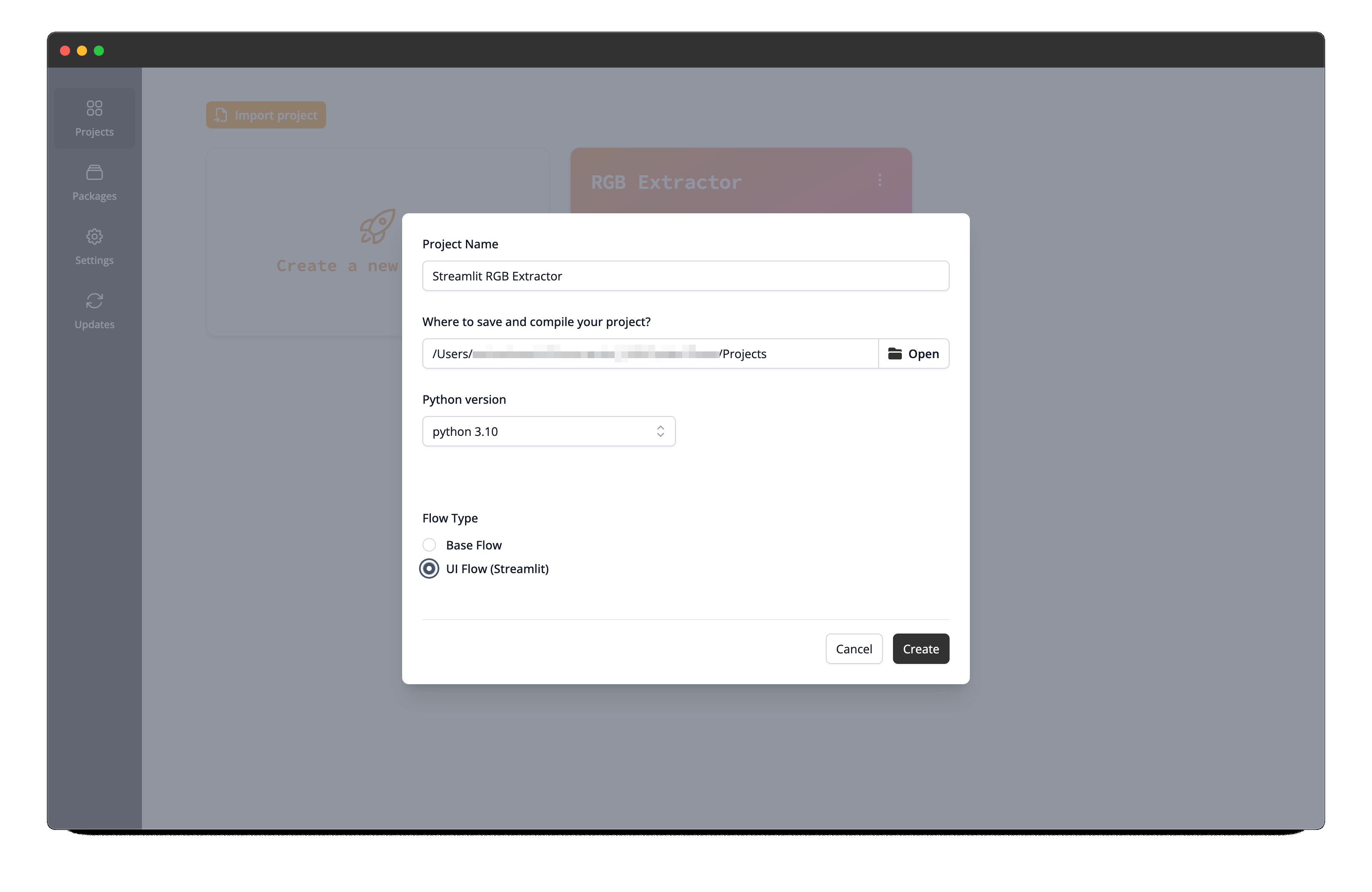
Click Create.
Python Version Handling
If the specific Python version you select isn't already available, CODED FLOWS will automatically download the required standalone Python build for you. This ensures your project runs in a consistent environment.
Understanding the Interface
Once your project is created, the UI Flow interface will open. It combines elements for building the visual layout and the underlying logic. Let's familiarize ourselves with the main components:
suggested screenshot: Overview of the empty UI Flow interface, showing the main areas: top action bar, sidebar toggle, main graph area.
Top Action Bar
Located at the very top, this bar contains essential controls:
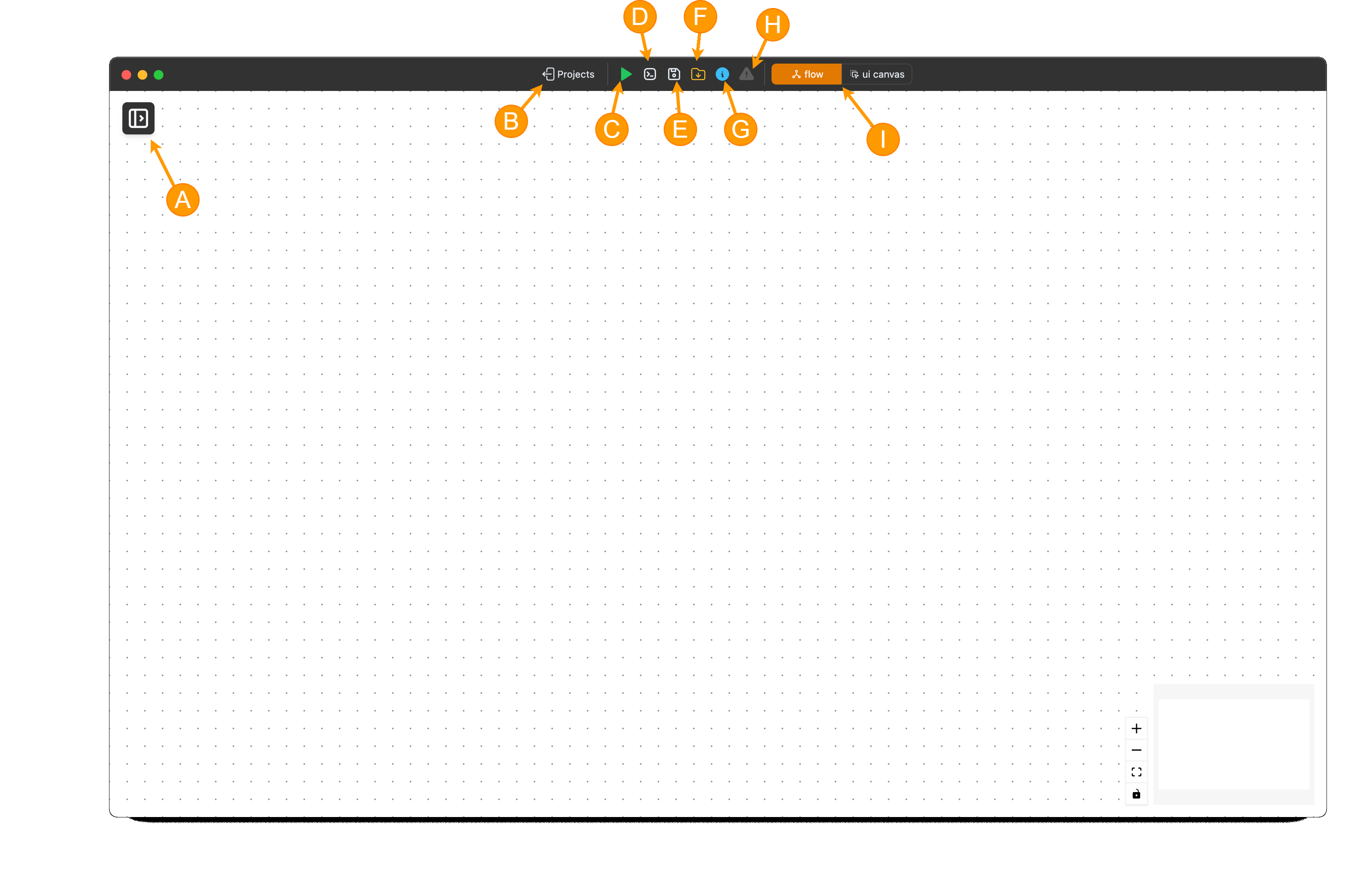
- (A) Toggle Sidebar: Click the Sidebar button to show or hide the sidebar.
- (B) Return to Projects: A button to go back to the list of your projects.
- (C) Execute/Stop: Buttons to start (run) the flow execution or forcefully stop it if it's already running.
- (D) Logs: Opens a dedicated window or panel to display real-time execution logs for your flow.
- (E) Save: Saves the current state of your visual flow graph.
- (F) Open Project Folder: Opens the underlying project directory on your filesystem.
- (G) Save Script: Generates a standalone Python script equivalent of your visual flow.
- (H) Brick Info: Displays or hides a quadrant where information about a Brick is shown.
- (I) Error Indicator: An icon that signals if there are errors. Clicking it usually reveals the error messages.
- (J) Canvas/Flow View Switcher: This toggle allows you to switch between the Canvas View (for designing the UI) and the Flow View (for defining the logic).
- (K) Flow Status Indicator: A visual status box providing real-time feedback on the flow state.
Sidebar
Located on the left toggled via a button in the top-left corner:
- Packages List: Displays available Python packages containing "Bricks" (visual components or functions). Standard Streamlit widgets and custom functions are organized here.
- Search Field: Allows you to quickly find specific bricks by name.
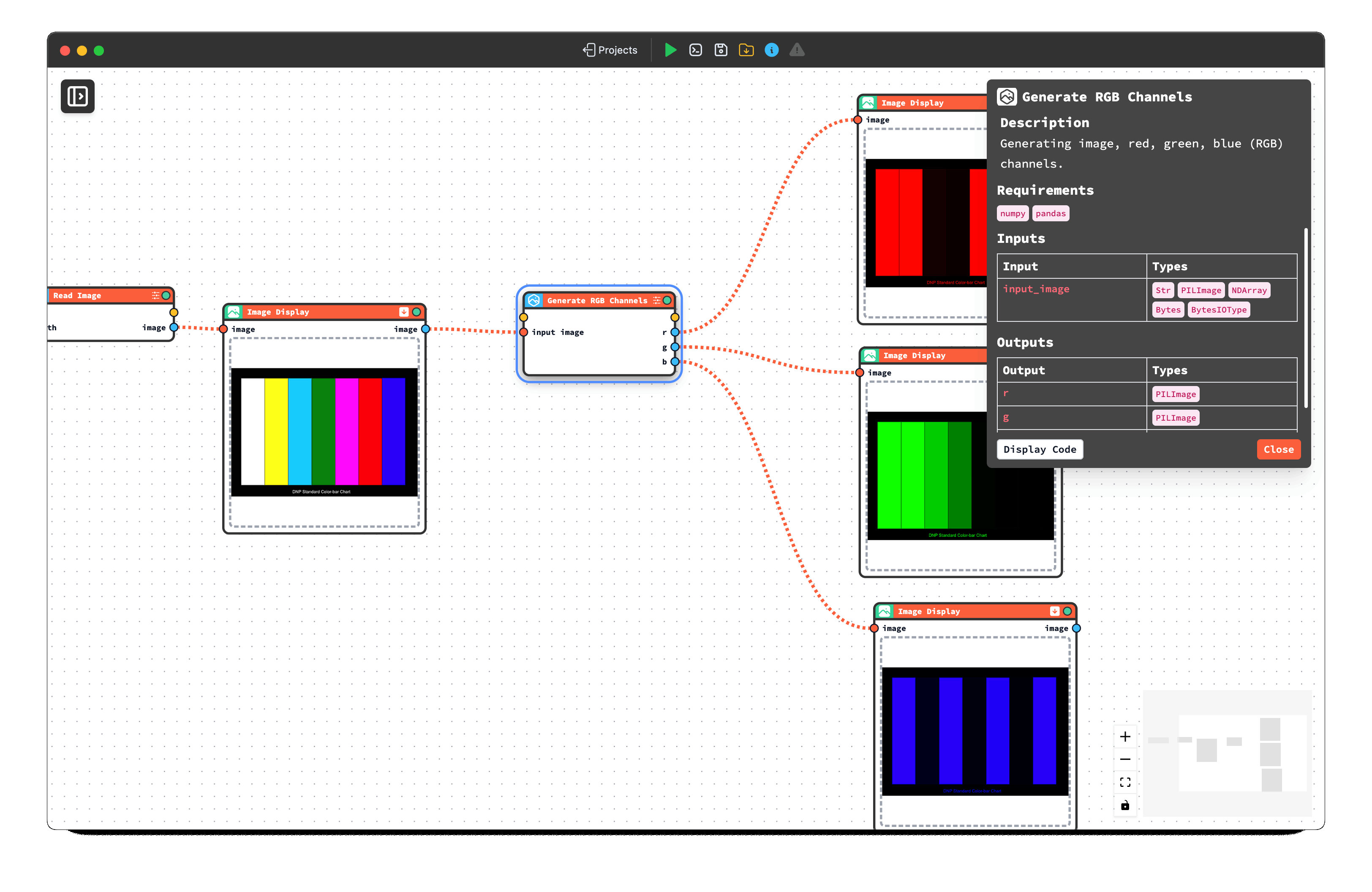
Brick Details
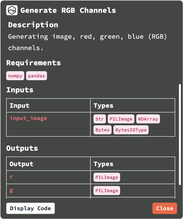
Double-click on a brick in the list. A Details Panel will appear (often docked in the top-left area). This panel shows:
- The brick's Description and its Pyhton requirements.
- Its Inputs and Outputs, along with their expected data types.
- A button to view the brick's detailed Documentation.
- A button to view the underlying Python Source Code of the brick's function.
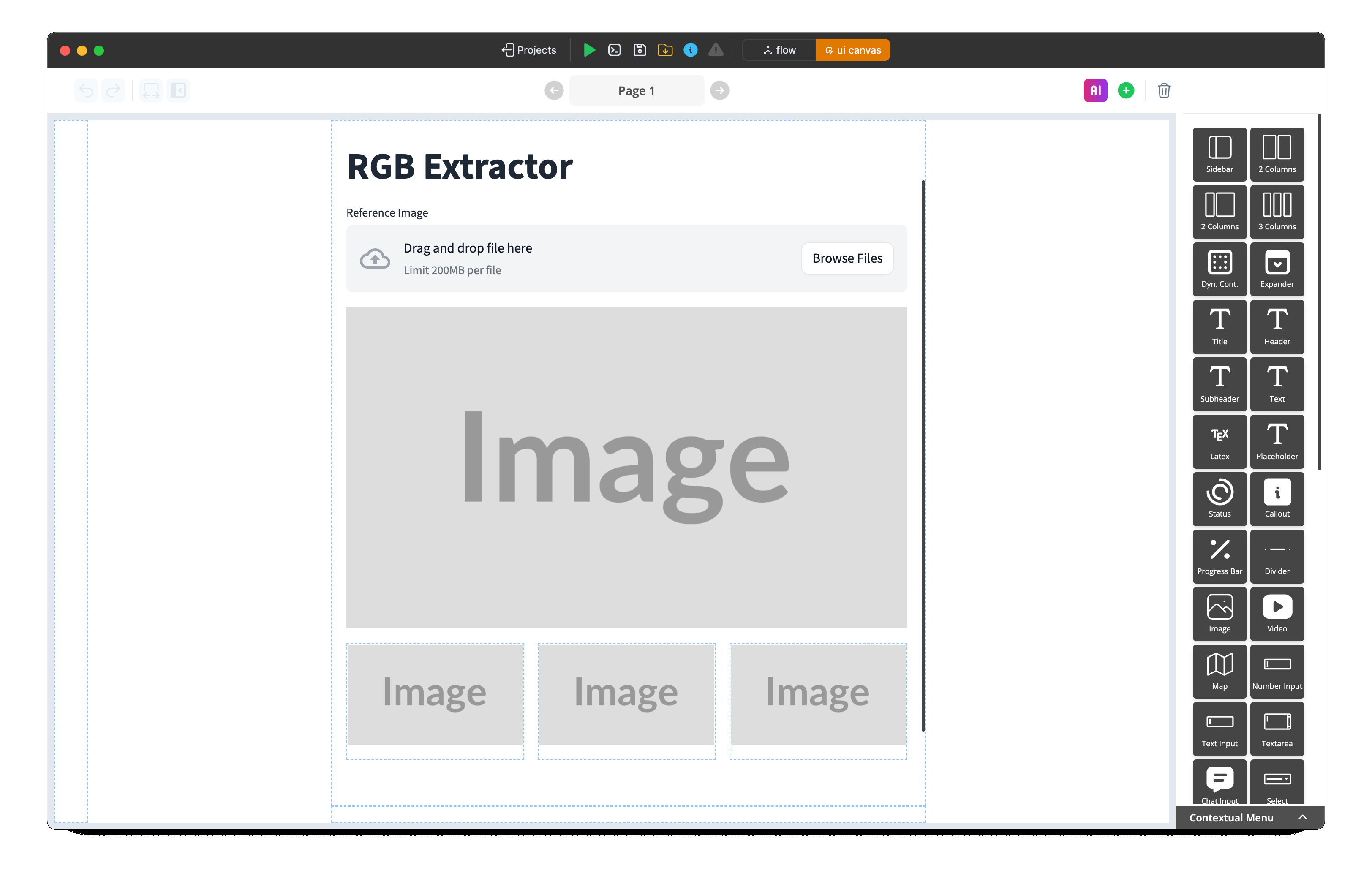
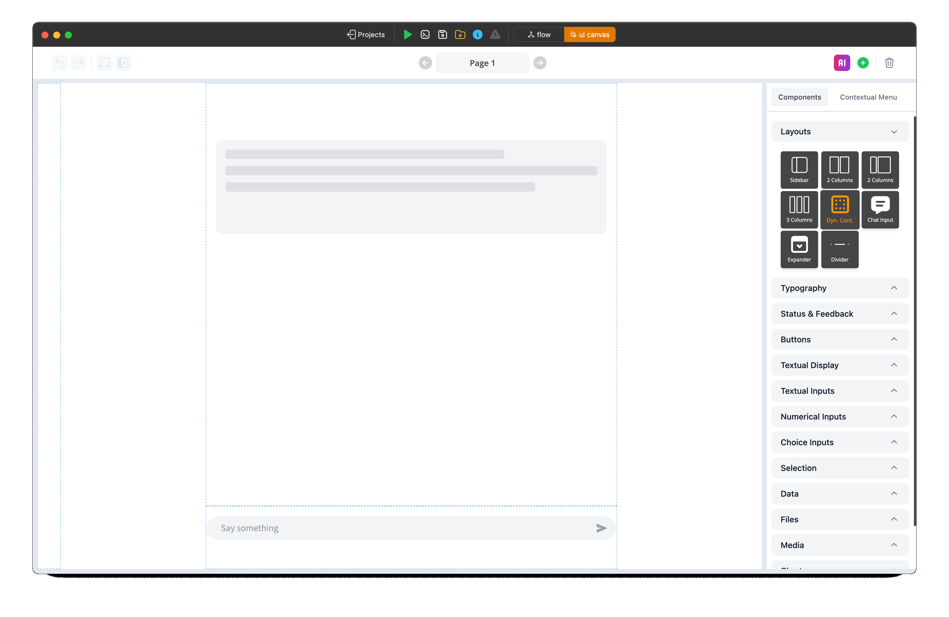
UI Canvas Interface
When switching to the ui canvas, you can create your visual canvas by dragging and dropping various visual elements.
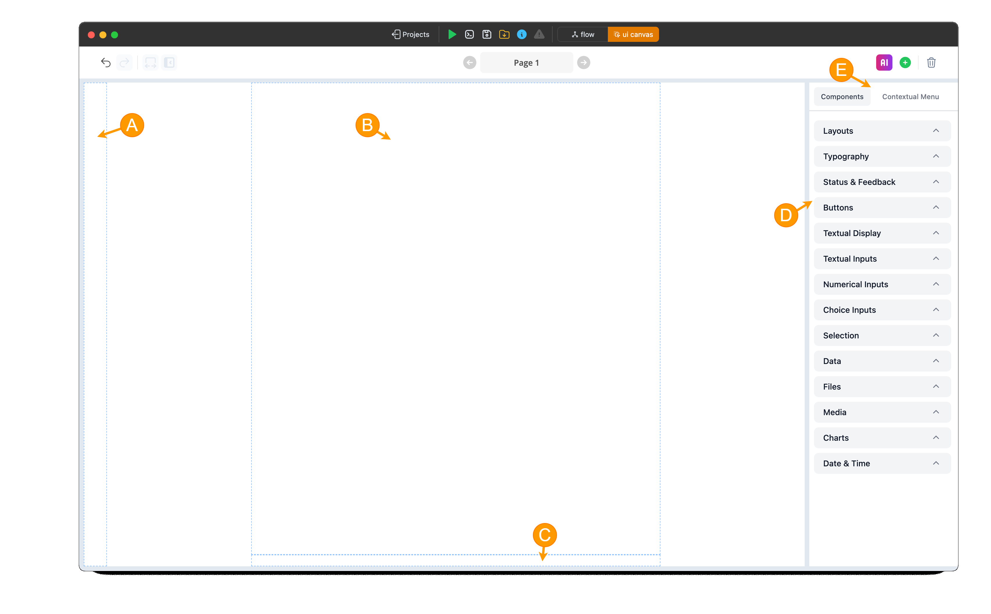
- (A) Sidebar Layout: To include a sidebar, drag and drop the sidebar layout into this reserved box.
- (B) Main layout: The primary layout box for the page.
- (C) Chat Input: A reserved layout box for placing a chat input visual element, ideal for creating a chatbot or chat-like app.
- (D) Visual Elements: Visual elements, grouped by categories, to facilitate navigation and selection for dragging and dropping.
- (E) Canvas Menu Switch: Switch between displaying available visual components and the contextual menu specific to the selected visual elements on the canvas. The contextual menu allows customization of the selected visual element.
Building the Streamlit Canvas
Now, let's design the user interface:
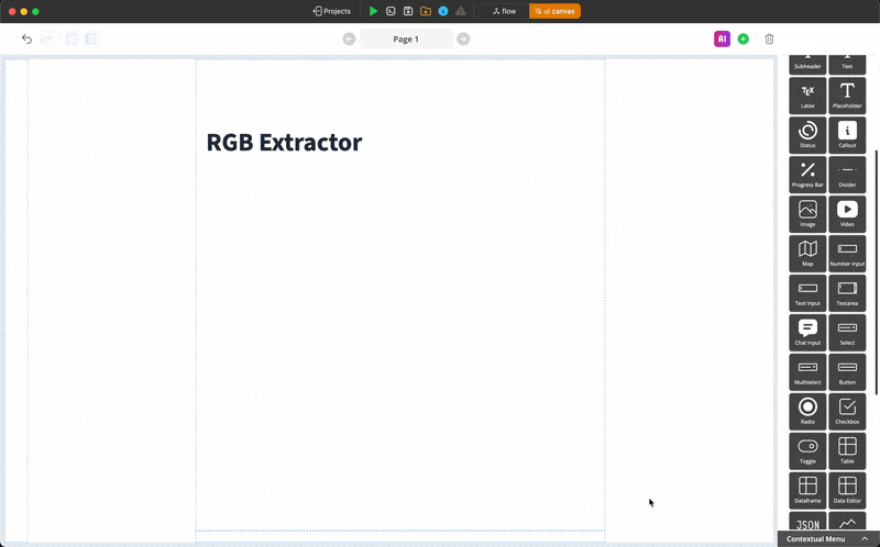
- Ensure you are in Canvas View by using the switcher in the top action bar.
- Drag and drop the visual elements you need onto the central canvas area. For our example, you might need:
- A
File Uploaderelement to allow users to upload an image. Columnsto arrange the output images side-by-side. Let's use three columns.- Four
Imagedisplay elements, one to display the reference image and one placed inside each column, to show the Red, Green, and Blue channels.
- A
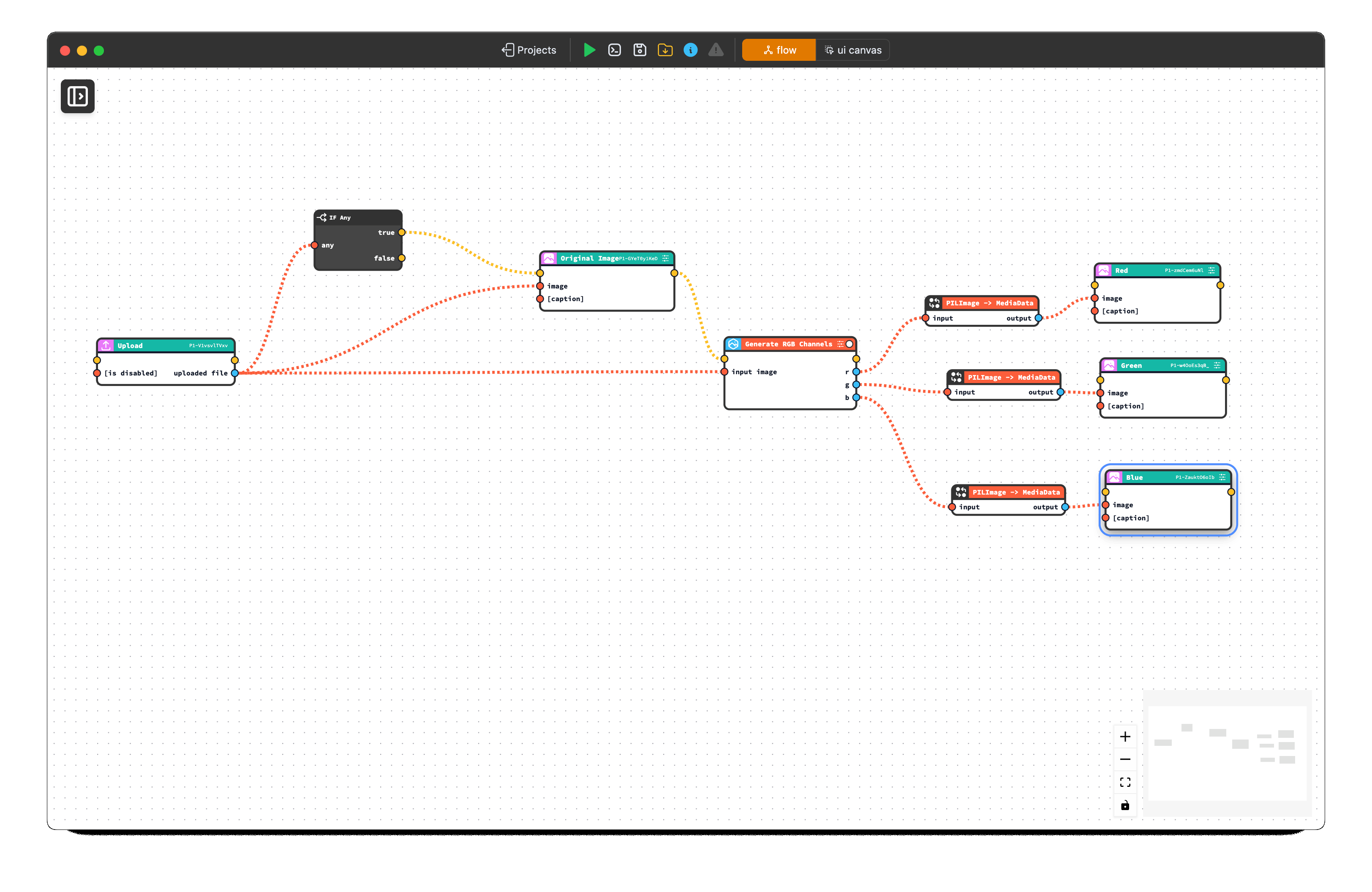
UI Elements as Bricks in Flow View
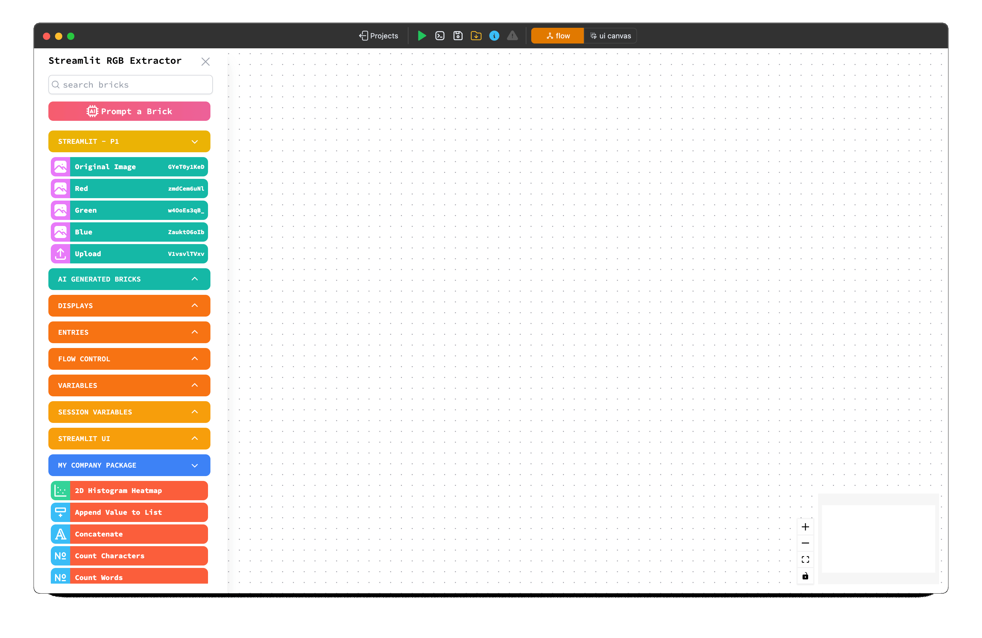
As you add elements to the canvas, CODED FLOWS automatically generates corresponding Bricks in the Flow View. These Bricks represent the UI elements and their events or properties, typically organized within a dedicated package named after the page (e.g., STREAMLIT - P1).
Constructing the Logic Flow
Next, we define how data flows and how UI elements interact:
- Switch to Flow View using the switcher in the top action bar. You should see Bricks representing the UI elements you added, organized in a package named STREAMLIT - P1.
- Find the necessary processing bricks. For our example, you'll likely need:
- Drag and drop these processing bricks onto the flow graph.
- Connect the bricks: Click and drag from an output port of one brick to an input port of another to define the sequence of operations.
Executing the Flow
With the canvas and flow defined, you can run the application:
- Click the Execute (Run) button in the top action bar.
- CODED FLOWS will process the flow and launch the Streamlit application. You should see the UI you designed in the Canvas View appear as a web application.
- Interact with the app (e.g., upload an image) to test the flow logic. The Red, Green, and Blue channels should appear in the designated image elements.
First Execution Time
The very first time you execute a flow within a project, it might take a bit longer. This is because CODED FLOWS needs to install any required Python packages (like Streamlit, Pillow, OpenCV, etc.) specified by the bricks you used into the project's dedicated environment. Subsequent executions will be significantly faster as the environment will already be set up.
Exporting as a Python Script
If you want to run your application outside of CODED FLOWS, deploy it, or share it as a standard Python script:
- Click the Save Script button in the top action bar.
- CODED FLOWS will generate the complete Streamlit application code.
- This script will be saved directly into your project folder. You can then run this script using
streamlit run your_script_name.pyin any environment with the necessary libraries installed, or use it for further deployment (e.g., Dockerization).
Working with Dynamic Container in UI Canvas
Understanding Static vs Dynamic Visuals Limitations
When you create your UI canvas through drag-and-drop operations or by leveraging AI generation capabilities, it's important to understand that the resulting page architecture is fundamentally static in nature. This means that while you can implement basic visibility controls (showing and hiding elements), the canvas cannot natively handle dynamic visual components that change, update, or regenerate content based on user interactions or data flows.
This static limitation becomes particularly apparent in scenarios requiring real-time content updates. Consider, for example, a chatbot interface where you need to display an evolving conversation history between users and the bot. Each exchange generates new message bubbles that must be dynamically added to the interface, positioned appropriately, and styled consistently. The static canvas approach simply cannot accommodate this type of fluid, data-driven content generation.
Introducing Dynamic Container ("Dyn. Cont.")
To address these dynamic requirements, the platform provides a specialized visual component called "Dyn. Cont." (short for Dynamic Container). This element serves as a container that enables the integration of sections containing dynamic visual elements within your otherwise static canvas structure.
The Dynamic Container component acts as a bridge between your static UI design and the dynamic elements your application requires. When you incorporate a "Dyn. Cont." element into your canvas, you're essentially designating a specific area where dynamic content can be rendered and managed programmatically. This could include dynamically generated lists of file names with corresponding action buttons, real-time chat message threads, or any other content that needs to change based on application state or user interactions.
Understanding the Brick Node System
When you add a Dynamic Container element to your canvas, the system automatically generates a corresponding brick node. This brick node is a crucial component that serves as the control mechanism for your dynamic content area.
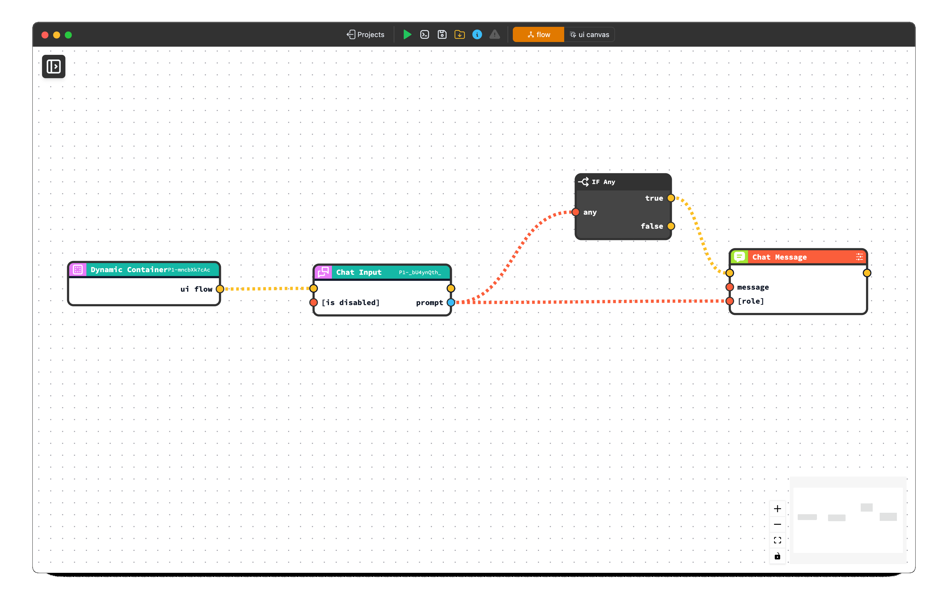
The generated brick node features a distinctive yellow output handle, which functions as a trigger mechanism. Any visual elements, logic flows, or UI components that you want to be part of the dynamic content must be connected to and originate from this yellow trigger edge.
It's critical to understand that elements not connected through this trigger relationship will not function as part of your dynamic content.
Dynamic Content Compatibility
Only the bricks found under the "STREAMLIT UI" package in the Package list are compatible with Dynamic Content containers. Regular static visual elements that you drag and drop from the canvas will NOT work within Dynamic Container areas, even if connected to the yellow trigger handle. Make sure to use the specialized dynamic UI components from the STREAMLIT UI package for proper functionality.
Accessing Dynamic UI Elements
The platform provides access to dynamic visual elements through the Package list under the STREAMLIT UI package. This collection contains the specialized components designed to work within Dynamic Container containers.
Currently, the available dynamic elements focus primarily on chat message functionality. While the current implementation centers around chat messaging functionality, the development roadmap includes plans to incorporate the complete range of Streamlit UI elements into the dynamic container system. This expansion will significantly broaden the scope of dynamic interfaces you can create, allowing for more complex and varied interactive experiences within your applications.